How To Take Better Farm Photos
The photos you post on your website, Facebook, and Instagram can have a huge impact on how people view your Farm. A trusted brand is proven to increase customer loyalty, which directly impacts how often customers purchase. With a few simple practices, you can improve the quality of your photos. In no time you’ll know how to enhance your Farm’s brand image, encourage customer interactions, and generate more frequent orders. Here are 7 quick photo tips to ensure higher quality photos:
See what we mean?
1. CLEAN YOUR LENS
This simple fix can actually make a huge difference. No one likes looking at blurry photos. For that matter, make sure your thumb isn’t the lens!
Too close for comfort!
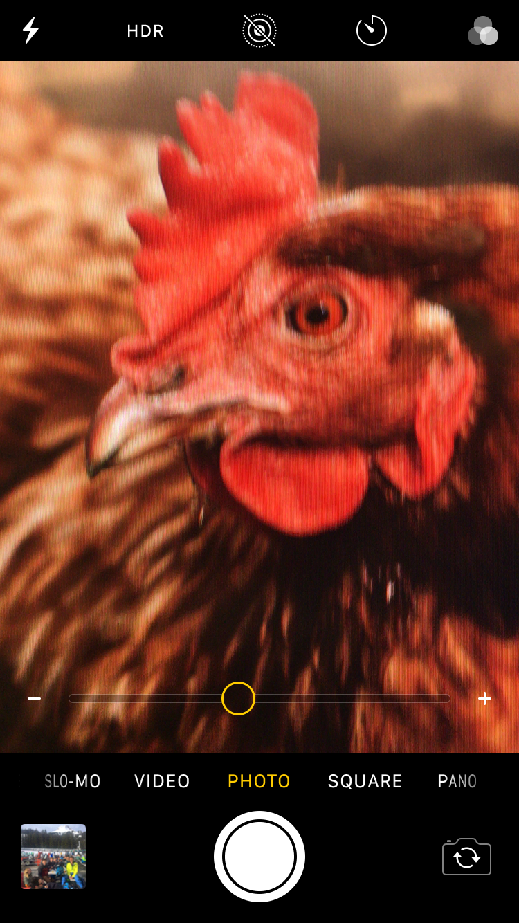
2. NEVER USE DIGITAL ZOOM
Zoom compromises the quality of a photo. Instead, take the photo at a normal distance and crop it later on your computer or phone. (Note: If you happen to have a camera with an adjustable lens—zoom all you want!)
Beautiful, right?
3. PAY ATTENTION TO LIGHTING
Take advantage of unique, natural lighting like early mornings, sunsets or storm clouds. As a general rule of thumb, make sure the primary source of light is behind you (i.e. the sun or light is shining on the back of your head, toward the object in your photo). And avoid using flash if possible!
4. FIND NEW PERSPECTIVES
Try getting low or higher (from the ground up, or using a “bird’s eye view” perspective), turn your camera on its side, or move around your subject as you shoot. Try getting closer, backing away—get creative with your approaches! Unique angles make photos more interesting and memorable.
Hmm…
That’s better.
He smiled for the camera.
5. FOCUS ON ONE SUBJECT
Even if there are multiple subjects in your frame, trying focusing on just one. This creates a focal point within the image you are capturing.
The 2/3 rule in action.
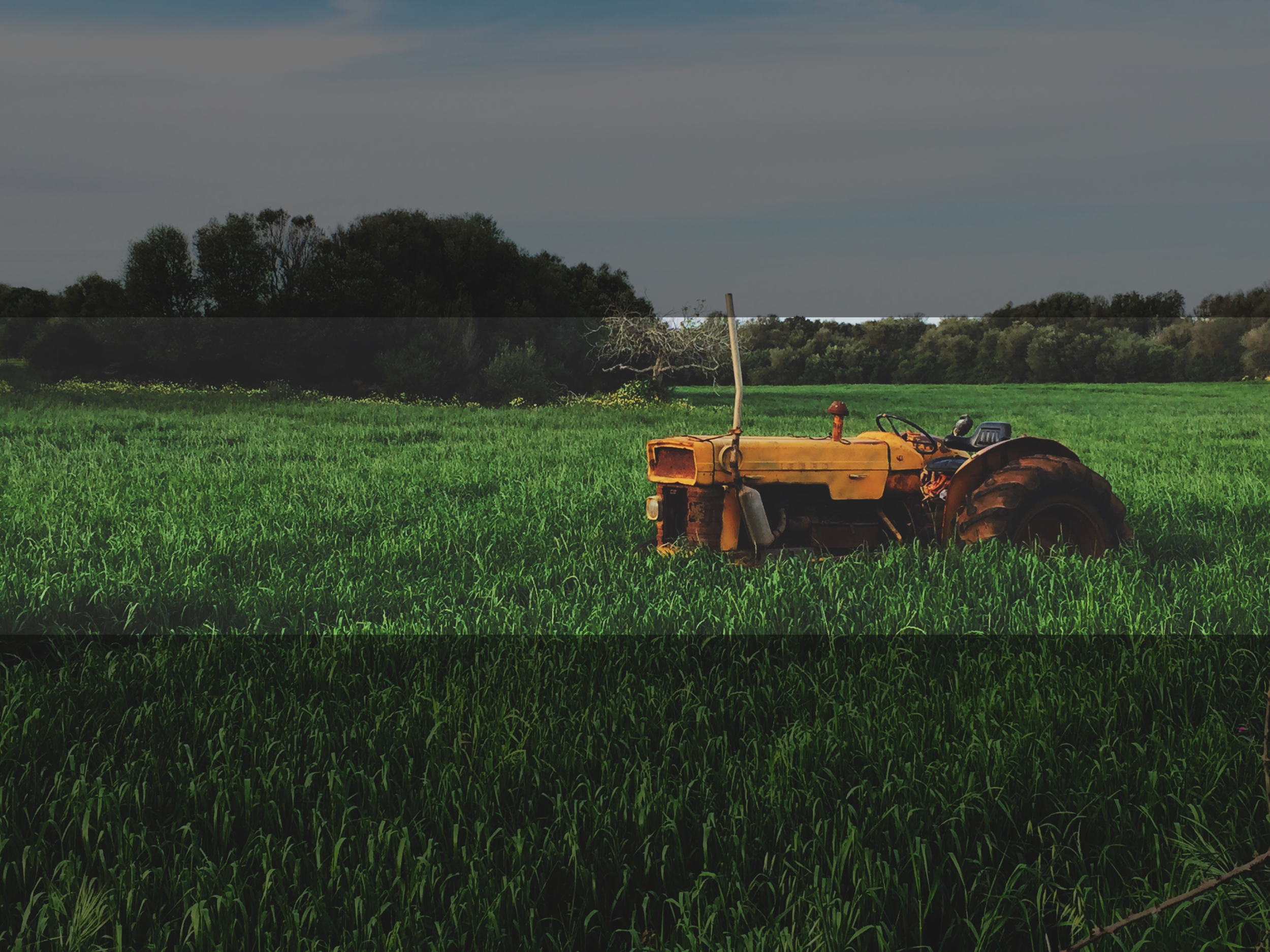
6. USE NEGATIVE SPACE
The subject shouldn’t fill the entire frame. Another best practice is to save about 2/3 of your photo for negative space. Believe it or not, this ensures that what you are intending to photograph is emphasized. The space around the subject of your photo will highlight it.
Additionally, negative space is often uniform and not busy (e.g. white space, green grass, cityscape, dirt field) so this makes the photo much easier on the eyes.
Example of a baaad photo.
7. KEEP IT SIMPLE
We love this advice across the board for your marketing materials. We get more into why “keep it simple” leads to increasing your orders in our free eBook, How to Avoid a Terrible Farm Website with No Sales. People want to get the information they need quickly, and they can’t very well do that if encumbered with unnecessary details.
So avoid using decorative borders or overdoing your photo edits. People want to see what the image actually looks like, not an over-styled version.
These best practices really do make a difference as far as the impression your Farm makes on visitors to your website and social media pages. If you need some help revamping your Farm’s website and social presence, give us a call at 1-833-9-BARN2DOOR or request a demo today. We’ll help you put your best foot forward.


